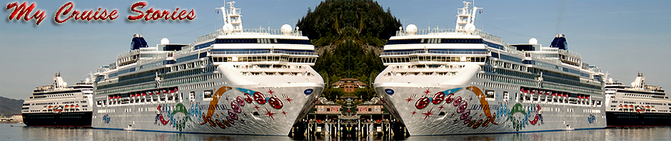

Splendor at night
The décor on the Splendor seemed so unusual that I decided to investigate the story behind it. Its style seems somehow more out there than the other Carnival ships I’ve sailed on. Probably due to the fact that it was originally designed for Costa and the European market, though Carnival Corporation did used to use the same designer for both cruise lines. The last ship he fully designed for Carnival was the Dream, but he did have a hand in some spaces on the Magic. The newer Breeze has a quite different and more modern look with its Caribbean casual décor by Partner Design of Hamburg.

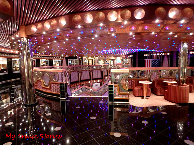
Looking down into the Splendor Atrium
Designer Joe Farcus decorated Carnival’s ships from the cruise line’s second ship the Carnivale in 1975 to 2008’s Dream. The Breeze which launched in 2012 was the first Carnival ship decorated completely by someone else since the original Carnival Cruise line ship the Mardi Gras in 1972.

the Lido restaurant area is decorated to resemble an old steamship
Splendor’s unique décor theme evident on the Lido is remembering the White Star Line.

model of the Queen Mary
The Lido is representative of the Queen Mary. It even has models of the Queen Mary and her sister ship Normandie by the stern pool.

bar by the aft pool looks like an old steamship
It has different unique themes in other public areas around the ship as well as a pearls theme running through most spaces. Each lounge has a story behind it and represents or replicates the original place that inspired the decor for that lounge. Even the coffee bar is a replica of an actual place designer Joe Farcus once visited in Columbia.

coffee bar on the Splendor
The Splendor is officially listed as Conquest class, but according to the hotel director on board it is actually in a mini-dream class of its own. It has some differences from other Conquest class ships and some features otherwise only found on Dream class ships.

Black Pearl Dining Room
The theme of pearls runs throughout the ship, but becomes most obvious in the Black and Gold Pearl dining rooms with their tubular horn-like shapes spouting pearls all around the walls. The light fixtures on the ceiling also have strings of “pearls” snaking around them.

the railings reminded me of hamburger buns
The row of round shapes that made up the stairway railings in the dining rooms reminded me more of hamburger buns than pearls.

Fried eggs or pearls on the oyster?
What looked like fried eggs all over the ceiling was probably supposed to be pearls in the oyster.
circles everywhere
Round pearl-like shapes are found in unlikely places all about the ship. Tables in some public areas have pink zebra-striped rings referred to as pink donuts by ship’s staff, and pink zebra-striped dots or rings cover many walls, particularly stairways and the halls in public areas.

stairway railings, ceiling lights, and pink dots
Even the stairway railings have round shapes, as do the ceilings and light fixtures near the stairs and elevators and other places around the ship. Besides the circular pearl shape the light fixtures also carry the old steamship theme in their looks-old-and-worn coloring.

Are the nipples really necessary in this hallway painting?
Returning to the White Star Line theme, paintings of people from an earlier era line the walls in hallways to guest rooms. Many of the women are in bathing suits in styles from early last century, some with too much showing even though it is covered. Some of the men are pictured smoking, which would have been far more acceptable in the era the pictures represent than it is now.

ugly statues at the spa
I’m not sure what it is with cruise ships and weird statues, but no matter who the ship belongs to a lot of them seem to have either really ugly or really odd statues. Then again odd and ugly statues are pretty common on dry land as well. Actually strange things are pretty common in all types of art and some people must like them or nobody would buy them.

stairway art
Each Carnival ship has unique décor and artwork. While a lot of the paintings hanging around the ship belong to the art auction, some are permanent. A considerable amount of the artwork throughout the Splendor contains nudity. As a Costa ship it would have sailed in the European market where nudes are more commonplace. People there are accustomed to the old Greek and Roman naked statues.

inappropriate yet entertaining elevator art
Americans are not so comfortable with nudity and on some ships Carnival has removed nude décor. The strangest piece of artwork among all the odd things that we found on the Splendor was a painting in an elevator which we dubbed “Naked Toilet Man.” It’s painted in mosaic style and many people in the elevator don’t notice what it actually is, but if you stand outside the elevator and look in it becomes much more obvious. It would be a shame if they removed it though because it was a good source of amusement – for us anyway. (We’re easily amused.)
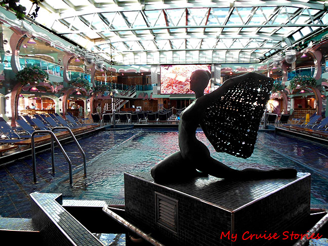
Lido pool with dome closed
We were told future plans to update the ship did not include the decor. Odd though it is, it does provide a contribution to the personality and history of the ship. With a name like Splendor perhaps people expect the over the top decor. Plain and simple just wouldn’t feel splendid.

The El Morocco Lounge has a Sahara Desert look

Do you officially Blog for Carnival Cruise lines then?
No, I’ve just sailed with them the most because their cruises tend to be budget-friendly and that works well for budget cruisers.
I hope they are PAYING YOU!!! 😉
No, and if they did then I would have to say what they wanted me to say rather than what I wanted to say, and I wouldn’t be able to write about other cruise lines. They have given us things like priority boarding, behind the scenes tours, and interviews with the captain and other influential people on the ship.
Overall I like the decor but those spa statues are just strange. I’m not really an abstract art fan though. I like all the circles especially in the stair railing.
Odd statues seem to be a required part of cruise ship decor. It seems like they all have some.
Love the name … The Breeze. Amazing how cruise ship decorators make it work.
I hadn’t really thought of it like that, but you’re right, the Breeze is kind of like a refreshing tropical breeze.
Splendor= gaudy, bulky, barf-like fixtures. The bulk of some fixtures gave me a claustaphobic feeling.
I found the story behind the wild décor quite interesting. I’d imagine you would be happier on a ship like the Vista, which has really no décor to speak of.